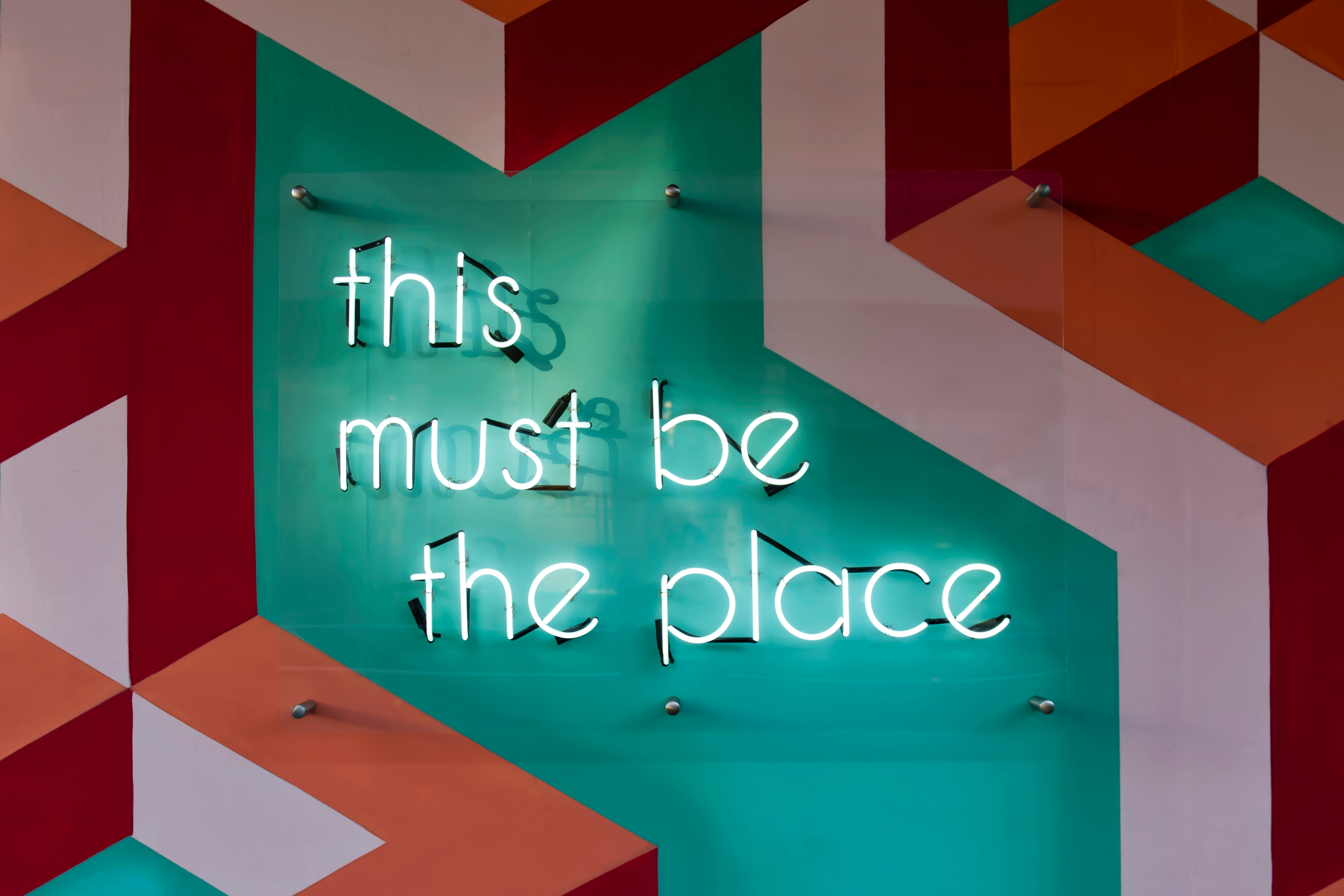
Colour plays a crucial role in shaping how people experience a brand. In hospitality especially—where mood and atmosphere are everything—colour can influence how a guest feels, what they order, and whether your venue leaves a lasting impression. The right palette can tie an entire concept together, from the front door to your Instagram feed. It's no accident that some brands are instantly recognisable, even without their logo.
Colours trigger emotions and associations long before guests know what’s on the menu. Blue, for example, evokes calm and trust—often used by concepts that focus on wellness, quality or relaxation. Red is energetic and appetite-boosting. Yellow brings a sense of cheerfulness and energy, while green is linked to nature, freshness and vitality. Black often conveys luxury or maturity, especially when paired with warm materials or metallic accents. And white brings clarity, space and balance—ideal for a clean, modern feel. Getting the balance right between warm and cool tones is key: warm hues like red and orange add vibrancy and energy, while cooler shades like blue and green promote calm and confidence. When combined effectively, colour can subtly shape behaviour too.
A visual foundation
In hospitality branding, colour is strategic besides decorative. A well-crafted brand guide lays the visual groundwork for your identity, and your colour palette sits at the heart of it. It typically includes a few core colours that define the brand’s personality and build recognition, supported by additional shades that allow for variety across touchpoints like social media or mural art.

Accent colours also serve a clear purpose, drawing attention to specific moments—think call-to-action buttons or standout items on a menu. When used consistently, a strong colour palette makes a brand visually powerful, instantly recognisable, and reinforces trust with guests.
Crimson with class or duck beak orange?
Take the rooftop bar Akai in Brussels, where we developed a palette that strikes a balance between bold expression and refinement. The base colours—Ivory Cream, Charcoal Black and Crimson—radiate warmth, elegance and depth. Ivory Cream offers softness and accessibility, Charcoal Black brings modern sophistication, and Crimson adds a bold, passionate edge. A splash of Bright Turquoise, used sparingly, nods to the Mediterranean and gives the palette a refreshing twist.

Another Brandchef example is The Ugly Duckling, a new restaurant group where colour helped define the brand’s overall aesthetic. We opted for a subtle, neutral palette built around Swan White and Charcoal Black—directly inspired by the swan in their logo. This combination offers a refined, calming presence. For contrast and personality, we introduced a punchy Reddish Orange (a nod to the beak), used as a detail colour to add energy without overwhelming the design.
Online, offline and everywhere in between
What makes colour so powerful in hospitality is how it works across every channel. It lives in your interiors, shows up on packaging and menus, guides people through spaces, and sets the tone across your digital platforms. And every colour has a job to do. In physical environments, earthy or warm tones create a sense of comfort, while cooler shades provide calm and clarity. On social media, fresh or eye-catching colours tend to perform better, grabbing attention in busy feeds. Strong contrasts matter too—not just for readability, but because colours can appear slightly different on screen, in print, or on a wall. That’s why a well-thought-out brand guide includes clear colour definitions in RGB, CMYK and HEX—so designers and printers stay on the same page.
A Colour palette is a foundational part of your brand experience—a visual language that says who you are and what you stand for. It isn’t just something you pick last-minute because ‘it looks nice’. It’s Whether you're launching a lively brunch spot or a fine dining destination, your brand colours set the tone for emotion, identity and recognition. Get it right, and you create not just visual impact, but long-term brand value.
Time for a new look?
Missing a colour palette in your brand strategy? Need a partner to help shape your brand guide? Let’s talk—no strings attached.


